Jennica Sandberg
Jennica Sandberg
Jennica Sandberg
Bringing Ideas to Life Through Web Design
Bringing Ideas to Life Through Web Design
Bringing Ideas to Life Through Web Design
A case study on creating a personal portfolio to attract clients.
A case study on creating a personal portfolio to attract clients.


Framer
Framer
Website Design
UX/UI
Published January 2024
Headquarters
Finland
Output
User-friendly design
SEO website Design
mobile page design
industry
Technology & Design
About the project
About the project
This website was created to serve as my professional portfolio and service offering hub designed to showcase my expertise in website design, software development, and content creation. With a tech-focused aesthetic, the website is built to appeal to businesses and individuals looking for professional, high-quality digital solutions.
This website was created to serve as my professional portfolio and service offering hub designed to showcase my expertise in website design, software development, and content creation. With a tech-focused aesthetic, the website is built to appeal to businesses and individuals looking for professional, high-quality digital solutions.
The Challenge
The Challenge
The main challenge was building a unique, cohesive design system from scratch that reflects the brand I’m building, is visually appealing and still remains functional and easy to navigate. As this was a personal project, balancing my creativity with a sense of professionalism was key to ensure that it remains attractive to potential clients.
The main challenge was building a unique, cohesive design system from scratch that reflects the brand I’m building, is visually appealing and still remains functional and easy to navigate. As this was a personal project, balancing my creativity with a sense of professionalism was key to ensure that it remains attractive to potential clients.
The Solution
The Solution
My solution involved creating a consistent design system that included a unique color palette, eye-catching typography that is still easy to read and a well-thought-out layout design. I iterated multiple times to ensure consistency across the site, and used Framer for the website’s architecture. Using Framer allowed for a smooth transition between design and development. I also custom-coded a specific asset in React to acheive the personal touch I wanted.
My solution involved creating a consistent design system that included a unique color palette, eye-catching typography that is still easy to read and a well-thought-out layout design. I iterated multiple times to ensure consistency across the site, and used Framer for the website’s architecture. Using Framer allowed for a smooth transition between design and development. I also custom-coded a specific asset in React to acheive the personal touch I wanted.



Design process
Design process
Visuals & Typography
Visuals & Typography
I opted for a tech-inspired color palette with cool purples and dark greys with some accent colors to reflect a modern brand. The typography was carefully chosen to balance legibility and style, with large bold headers to draw attention and clean, sans-serif fonts for readability. By playing around with opacity and font weight, each element was created to guide the user’s eye naturally through the content.
I opted for a tech-inspired color palette with cool purples and dark greys with some accent colors to reflect a modern brand. The typography was carefully chosen to balance legibility and style, with large bold headers to draw attention and clean, sans-serif fonts for readability. By playing around with opacity and font weight, each element was created to guide the user’s eye naturally through the content.
96 px
96 px
1.2
Heading 1
H1
H1
60 px
60 px
1.2
Heading 2
H2
H2
48 px
48 px
1.2
Heading 3
H3
H3
32 px
32 px
1.2
Heading 4
H4
H4
24 px
24 px
1.2
Heading 5
H5
H5
20 px
20 px
1.2
Heading 6
H6
H6
16 px
16 px
1.6
Body
14 px
14 px
1.8
Body 2
14 px
14 px
1.2
BUtton
10 px
10 px
1.2
OVERLINE
12 px
12 px
1.2
Caption
16 px
16 px
1.2
Subtitle 1
14 px
14 px
1.2
Subtitle 2
Illustrations & Icons
Illustrations & Icons
While I didn't use custom illustrations for this project, I selected a set of sleek, minimalist icons from iconoir.com that perfectly matched the tech-inspired aesthetic of the website. The icons were chosen for their minimalistic and modern feel, aligning with the overall design of the site.
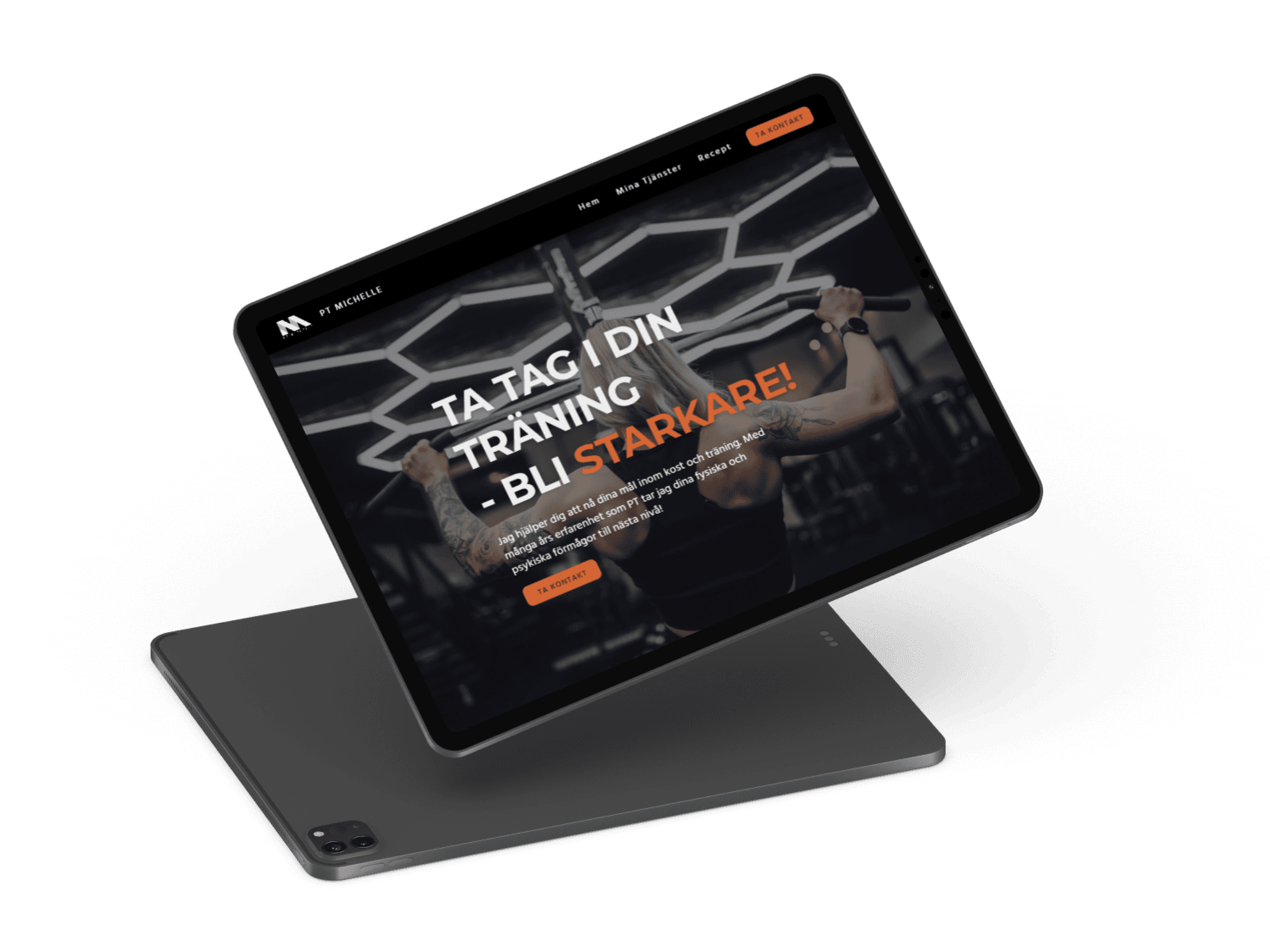
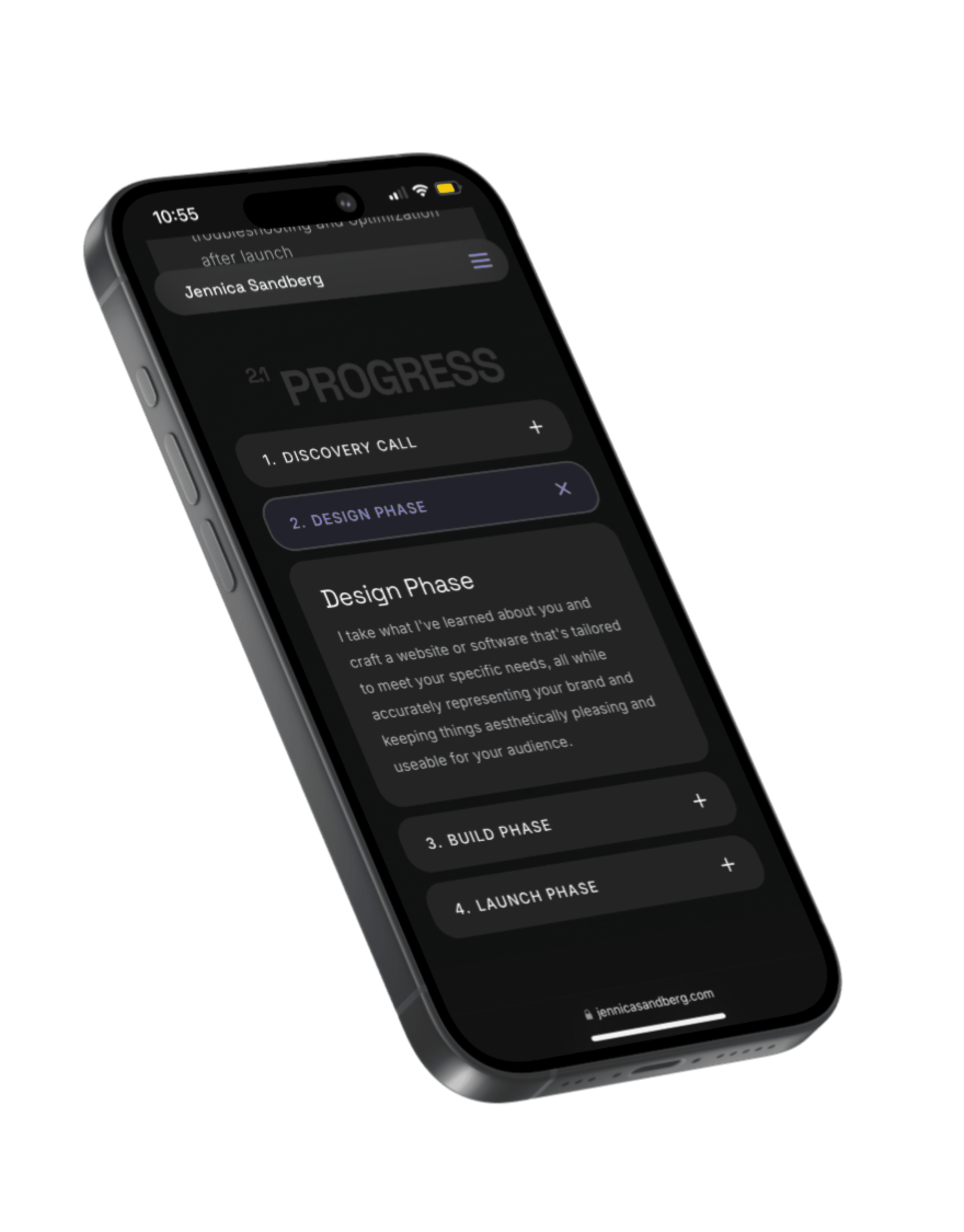
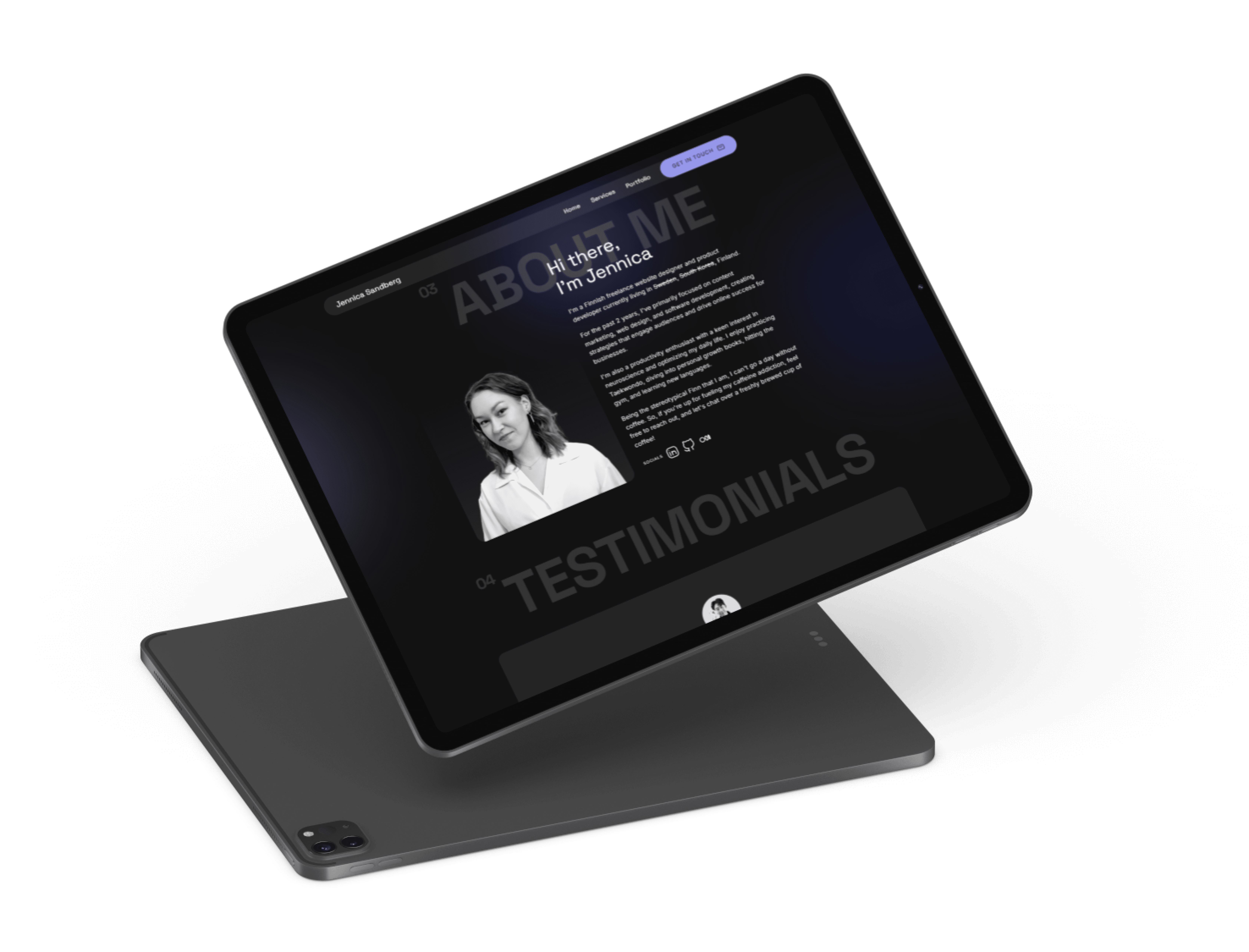
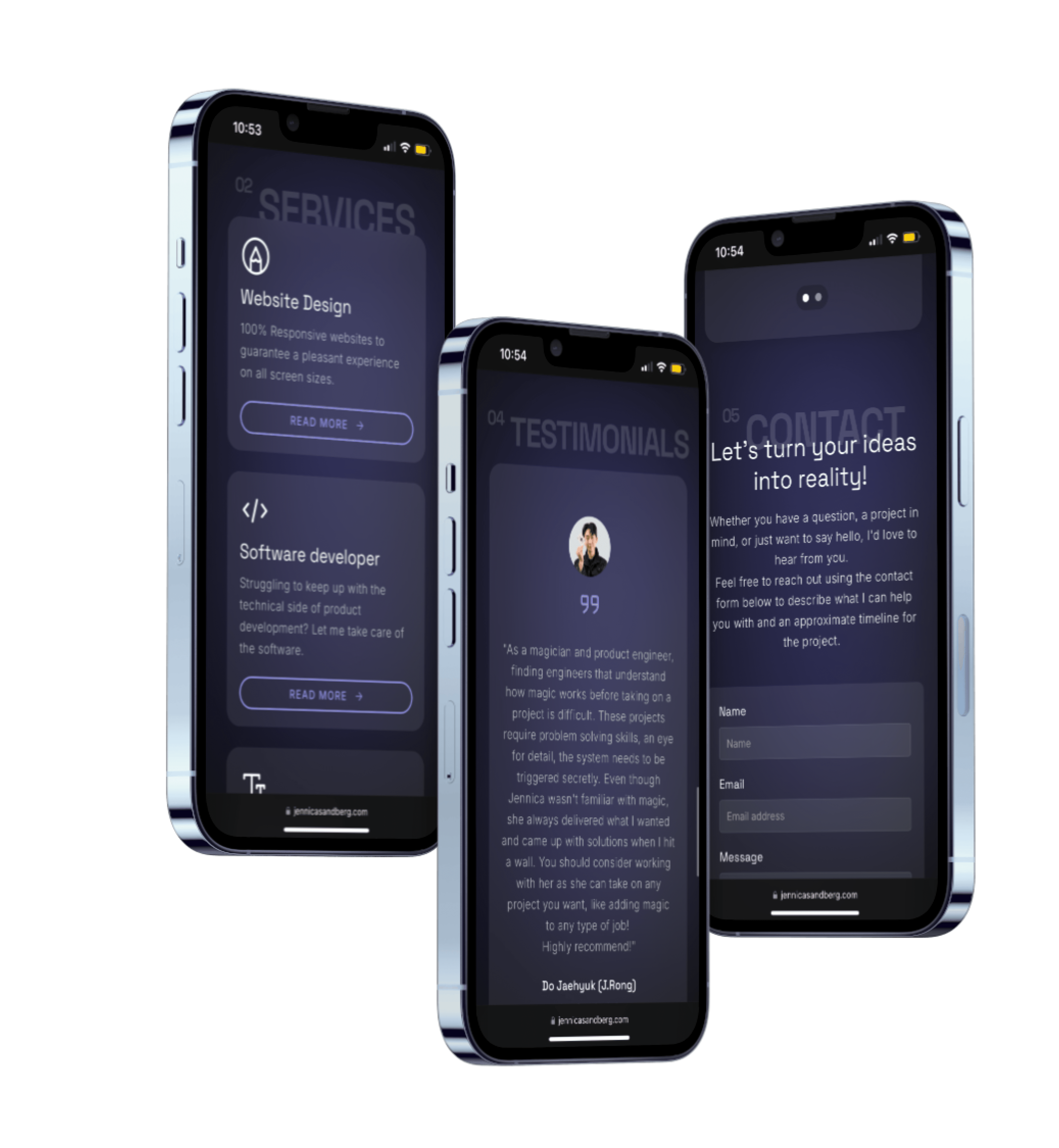
For the case studies, I incorporated technological mockups to enhance the presentation of each project. These mockups visually communicate how the designs and developments would function in real-world applications, giving potential clients a clearer understanding of the final deliverables.
Primary Brand
Primary Brand
700
700
#9797ED
#9797ED
Primary variant
Primary variant
Primary variant
700
700
700
#271DA6
#271DA6
#271DA6
Secondary
Secondary
Secondary
200
200
200
#5555E2
#5555E2
#5555E2
Primary Brand
700
#9797ED
Background
Background
Background
#121212
#121212
#121212
Surface
Surface
Surface
#1C1C1C
#1C1C1C
#1C1C1C
Error
Error
Error
#CF6679
#CF6679
#CF6679
On background
On background
On background
#FFFFFF
#FFFFFF
#FFFFFF
On Surface
On Surface
On Surface
#FFFFFF
#FFFFFF
#FFFFFF
On Error
On Error
On Error
#000000
#000000
#000000
On Primary
On Primary
On Primary
#000000
#000000
#000000
On Secondary
On Secondary
On Secondary
#FFFFFF
#FFFFFF
#FFFFFF
Development process
Development process
Technology Stack
Technology Stack
Framer
Framer

React
Results
Results
Results
Results
Since launching, the website has attracted increased traffic, drawing in more visitors who are interested in my services. I’ve received positive feedback, with many commenting on the modern design that seem to resonate well with the target audience. The clean layout has made it easy for potential clients to navigate and engage with my content.
Since launching, the website has attracted increased traffic, drawing in more visitors who are interested in my services. I’ve received positive feedback, with many commenting on the modern design that seem to resonate well with the target audience. The clean layout has made it easy for potential clients to navigate and engage with my content.

Conclusion
Conclusion
Conclusion
Conclusion
This project was a valuable learning experience that allowed me to refine both my design and development skills. I am particularly proud of how the design system came together, balancing aesthetics with functionality. In the future, I would aim to optimize the site further for SEO and explore additional integrations to enhance the user experience.
This project was a valuable learning experience that allowed me to refine both my design and development skills. I am particularly proud of how the design system came together, balancing aesthetics with functionality. In the future, I would aim to optimize the site further for SEO and explore additional integrations to enhance the user experience.
